Showing posts with label Paul Clifford - Harvest of 2011. Show all posts

Friday, 6 February 2015

Harvest of 2011 Part Three - The 'Something Else' Power of Symbols

Harvest of 2011 links

Harvest of 2011 continues... previous parts are linked just above.

Click on each image to enlarge it, and also comment on and Like images at the Facebook gallery - here.
You can comment on the post as a whole at the bottom.
All pictures are available as limited edition prints - click here for details.


These are some more of my favourite 2011 images. This time I'll be writing not so much about how the image looks, or was composed, but instead dealing more with how our minds make sense of the pictures, attaching meanings in some quite astounding ways.

The images here include text, numbers and symbols - always signifiers for something else, something that someone wants you to know or think. As such, they have to be handled carefully in photographs, so as not to rupture or overwhelm careful composition.


4580 - Totland, England, 2011
When I include a signifier like text in an image, it's mainly as another compositional element. But it can't be denied that including visual language like the word 'RAMBLER' unavoidably adds something else. It's that 'something else' that I always bear in mind when including text, numbers or symbols. Although this image has a lot to visual information, the mind is initially only thinking 'RAMBLER' and the picture therefore takes a few moments to settle down. The word itself does offer up a clue as to how the image could be interpreted - rather than cluttering the meaning, words may extend it.


4423 - London, England, 2011
Whilst RAMBLER was a part of the image, sometimes my use of text plays a more major role. This picture becomes a little jarring, almost like an optical illusion, with the simplest of means.


4114 - London, England, 2011
Here is another image that plays with expectations of text. 'NO' is usually a precursor to another word, the start of a prohibition. By again looking past the text into the image itself, we can see that this 'NO' isn't that, and never was. Stripped of it's original purpose, it now resembles instead a blunt graffiti-esque statement.


4155 - London, England, 2011
The more I think about the messages in the environment, the more they become abstracted for me - and in the context of thinking about text, hopefully I have allowed you to see this image differently. For me, it is a very nourishing picture that gains more meaning the more you time you give it.


4171 - London, England, 2011
4352 - Ange, Sweden, 2011
4361 - Blomsterstigen, Sweden, 2011
Numbers are of course equally significant in the environment. These three pictures have very little in common visually, but all feature a simple two digit number. Each number delivers a different message to us, discernable by context based on our own previous experience of how they are used. An address, an instruction, a label.

We can see how much work our minds put in by simply flipping two of these upside down -


Perhaps the effect is a little lessened by seeing the originals above directly before, but you can see how the numbers become just shapes, or perhaps you automatically redefine them as 'LI' and 'OE' even though this makes little sense.


4440 - Sevenoaks, England, 2011
This well known symbol is clear in its meaning - it's that very meaning that the photograph plays upon. The sign becoming overgrown by the seemingly gentler yet absolutely overwhelming force of nature, the clash of colour reflecting the conflict, and perhaps a further meaning warning against incursion into nature. A simple image lent so much more by symbolism, and by the deeper meaning each viewer brings.


4563 - Needles, England, 2011
4616 - Ventnor, England, 2011
Both of these are, it could be said, strange and unusual signs. Both seem a little unreal. Clearly rockets haven't been tested for some time, but the image retains a kind of dangerous romance. It's unclear from the second image what we are looking at and the text brings interesting questions - what is this thing, how does it work? Taking these signs out of context, keeping elements out of the frame, leaves much of the interpretation to the viewer. 


4595 - Shanklin, England, 2011
 A more familiar piece of 'signage', but again not quite right.


4643 - London, England, 2011
I really enjoy the mixture of materials in this - the hard pavements, the small puddle - solid and liquid, all that's missing is GAS - provided to us in a signifier, emerging from the water, held in place by the square paving around it.


4602 - Cowes, England, 2011
Finally, a message disappearing into the water - another example of meaning left open to misinterpretation by reality.


Throughout this post I've tried to talk about meaning and interpretation - and less about colour and composition - it's worth going back and looking at the images on a purely visual level, without reading the text. You can also see them without my commentary at the Facebook gallery here. Your own commentary is very welcome there though, on each image as you choose. Alternatively, you can comment below if you want to say anything about the blog post as a whole. Please do comment, I love any kind of feedback. Also feel free to link to any of your own images or other pictures you think might be of interest.

Part Four soon. Thank you for reading! All pictures are available as limited edition prints - click here for details.


Harvest of 2011 links
Introduction - Part One
Part Two

Tuesday, 18 November 2014

Harvest of 2011 Part Two - Put it in the Middle

Harvest of 2011 links
Introduction - Part One

Harvest of 2011 continues... previous parts are linked just above.


Click on each image to enlarge it, and also comment on and Like images at the Facebook gallery - here.
You can comment on the post as a whole at the bottom.
All pictures are available as limited edition prints - click here for details.


This time I'll be looking at images where a central motif is key to making the image work, for various reasons. When teaching photography, placing your subject dead centre is often noted as the wrong thing to do, a 'mistake'. I don't agree. Sometimes it is desirable, or essential, to push things around in the frame to balance the image, and sometimes a strong central subject can anchor an image and radiate calm across the composition. 
 
4330 - Svartvik, Sweden, 2011
This first image is a perfect example of that, and as it is actually one end of an anchor chain, it does seem like a good place to start. This is one of my favourite images from 2011 - the lightweight colours and simple composition form a wonderful balance, but the heaviness of the chain creates a downward tension that means the image never entirely relaxes.


4088 - London, England, 2011
4330 - Svartvik, Sweden, 2011
Two images where the central composition highlights some near perfect symmetry. In 4088 the bollard becomes almost menacing in it's straightforwardness, but the beastly effect is somewhat punctured by the playful wavy crack that plays across the top of the image.

The second image holds a quiet mystery - by documenting tightly, face on, we are left with very little to think about other than the lines and shades that make up the peaceful image. It's abstract, but clearly sourced from a real object, even if the exact nature of it is disguised.
4076 - London, England, 2011
4638 - London, England, 2011
The fierce reds of the two street lights - illuminated or not - should dominate these pictures. For me, however, the light in 4076 is so weak that it seems to diminish the lamp itself, with the two small cables either side bullying it into submission. I think these two photographs are fascinating together - one on white, one on black, creating an entirely different feeling from two superficially very similar objects.
 
4107 - London, England, 2011


I will often create my own layouts from the various pipes, cables, clips and brackets we see on walls across our urban landscape - perfectly illustrated here. What starts as a very simple image is revealed as a jumble of elements the longer you look. Again, red is in charge - but it's not the circle in the centre, it's the cable along the bottom that steals the show.


4102 - London, England, 2011
And here's another example of applying a rigid compositional structure to a selected and curated piece of street wall. All seems straightforward and in order, but some of the bricks, and particularly the thin white strip, seem to be struggling to stay straight. I do enjoy that slight disorder - as if the green moisture is a kind of infection breaking up the no doubt once clean lines.

4412 - London, England, 2011
A powerful image creating drama from something on a very small scale. The central composition and the tight focus on the back wall helps to give power to this very small light that in reality, illuminates only a single step.


4121 - London, England, 2011
The top two thirds of this picture are so chaotic, that it is almost absurd to try and impose order upon it. However, work
ing centrally helps to keep the image still as it reveals what we are looking at - a wall ravaged and decorated by the drip-drip of pollution. A single cigarette packet becomes our only placeholder for the real world.

This is walked past by hundreds, perhaps thousands of people every day - it's not given a second look. To me, the colours of decay in this small spot are fascinating, and I was proud to capture it.


4258 - Highcliffe, England, 2011

4366 - Hamrafjallet, Sweden, 2011
For these two images, the only thing that matters is the relationship between the two elements. So the composition is pared right down to a kind of visual poetry, to allow them to speak more easily to each other, and allow the viewer to read the relationship clearly.

 
4609 - East Cowes, England, 2011
More peaceful visual poetry. Benches often crop up in my work, their form is very succinct - so that even set as far off as this one, it's clear what it is.
 
4436 - Sevenoaks, England, 2011
This is another image where having the motif absolutely central makes perfect sense. Despite the sloping horizon and bouncing cables, the picture remains all about this post in this field, despite the fierce colours elsewhere.
   

4344 - Klovsjo, Sweden, 2011
Here's another favourite of mine. I love the mystery of this situation - you can bring so much of yourself to the image. The simple shapes are appealing too - the blue rectangle on a triangle on a circle, with the ghost of a tyre track circle in front.


4319 - Sidsjon, Sweden, 2011
4557 - Yarmouth, England, 2011
Sometimes I see my photography as an ongoing sketchbook of images - souvenirs of the world as I see it. Taken as a whole, it can seem a rambling, disjointed series of images. But commonalities do appear. Taken two months apart, these two pictures can be seen as part of just such an emerging series - and one that is particularly relevant here, because the centering of the composition is so important. I don't specifically look to create a repeating theme, they seem to occur naturally. However, once I've noted the occurrence, I do become more aware of subsequent potential images when I see them. 
 
4278 - Downton, England, 2011
Like some of the other pictures in this part, here I've presented something in a simple, centred manner to create an unusual view - one that hopefully serves to highlight the visual interest in a mundane situation. The pipe has been abstracted to an unfamiliar shape, with the shadow giving it away, and the dust lies in horizontal strips. I'm reluctant to say any more about what you're looking at, but it is an entirely mundane situation.


4283 - Downton, England, 2011
Although my photography is very carefully constructed within the picture frame, I never actually move anything or set anything up to suit the image - that's just not part of my practice. I like to take pictures of what's I see around me, without adding or subtracting anything - to me, that's the appeal. I say this here because this does look like a contrived set up, but it really is just a hose that someone has collected up and left like this for now. As with all the images in this part, it's the centering that gives the photograph it's character, particularly here the 'trunk', if you like, disappearing off the bottom centre. This is a popular image, and it may be because it's feels so bright and positive.


4291 - Lyndhurst, England, 2011
Positioning this piece of architecture centrally in the image means it takes the viewer a little bit of time to work out just what it is. It initially perhaps resembles a traffic island - but this junction is a little different as each side differs from the other for entirely practical reasons. Working together, they control, divide and ferry various elements where two streets meet, managing flow on the way downhill. I love the problem solving nature of it - and I also like how this picture brings together these two materials in the frame with an equal weight.


4358 - Boka Harjedalen, Sweden, 2011
Perhaps the most central image of all on this page - this one really offers no compromise, a strong image created from very little.


4489 - Folkestone, England, 2011
A fitting end - the central motif leading off into the depths. It's a kind of inverted version of the disappearing posts in 4319 and 4557 above, but more out of control in a way. It takes a second look to see if those slanted lines taking the posts off centre are shadows, or something else. And although we are perpendicular to the line of posts, they do trail in from the left, which helps to draw us into the image and out to sea.

 
In all the images here, composing centrally encourages the viewer to consider the subject  in different ways, depending on the picture content. I hope I've able to explain myself a little, and illustrate that the first and last rule when composing a photograph is - there are no rules!


That's it for Part Two. The Facebook gallery for individual image comments is here, and you can comment below if you want to say anything about the blog post as a whole.

Part Three soon. Thank you for reading! All pictures are available as limited edition prints - click here for details.


Harvest of 2011 links
Introduction - Part One

Sunday, 21 September 2014

Harvest of 2011 Part One - More Doors, More Windows

If you haven't read it yet, you may want to start with the short introduction to this blog series - find it here.
Click on each image to enlarge it, and also comment on and Like images at the Facebook gallery - here. You can comment on the post as a whole at the bottom. All pictures are available as limited edition prints - click here for details.
4618 - Ryde, England, 2011
Here's a nice one to ease us in - a door and a window, an ongoing theme of mine. Lots to look at here - overall I love the colours and the distribution of the green and blue, plus the three chiming grills at the top and base of the wall keeping everything ordered. As is so often the case, it's the details that keep me interested (click on the image to enlarge afor a closer look) - the padlocks, the bricks falling away top left, the white stain, the enforced grid on the window.


4105 - London, England, 2011
Here too, the colour draws you in, a strong red and white, but the details keep you engaged. This is under a railway bridge, hence the muted, somewhat painterly light on a door and wall that never see the sun.


4130 - Tattershall, England, 2011
A lone window this time, falling into sheer black, and another brick wall. Whilst the mossy, messy bricks are fascinating - note how they have to smarten up their act a little around the window - the bottom strip of modernity throws the handmade wall into contrast, stressing the very horizontal nature of the image.

4097 - London, England, 2011
Here's an example of my creating a composition to try and make something that may look fairly normal on the street into something odd and intriguing. Appearing somewhat like a collage, the scales and textures are all wrong somehow, and the elements don't seem to quite get comfortable next to each other.

4081 - London, England, 2011
When I have a picture that contains a collection of items sitting in relation to each other, I sometimes feel there are at least two dialogues happening - one is how the colours and shapes inhabit the frame as a whole, and the other is more about a kind of dialogue between the objects themselves. I can see them with an imagined personality or action. Here, for example, the snake of a black pipe seems to be trying to creep towards the windows, adding movement and drama to the image.

4084 - London, England, 2011
Similarly, I can't help but add my own fiction to images like this one. A single lonely light behind a single lonely window. What goes on inside?


4191 - London, England, 2011
I don't seem to tire of doors and windows. This one was irresistible, due to the striking colour contrasts. The blue is heightened by the boxes in the window. Again, so much to see too - check out the angles and construction of the window, and are those grooves on the wall bricks, or something else? More imagined stories...
4304 - London, England, 2011
Most of my door and window images seem to focus on dilapidated and worn facades, but  the clean lines of a fresh white space allow for some interesting compositions too. Here we are in a gallery, where the environment is strictly controlled visually, looking out over the chaos of rooftops. In terms of where the window and exit sign are placed in the image - this kind of thing is something I take a lot of time over and I can only explain that when it feels balanced to me, then it's right.

4573 - Alum Bay, England, 2011
I've noticed that a lot of my windows have been blocked or erased, this particular one has obviously outlived its usefulness or even become a hindrance. As well as acting as an interesting compositional element, it holds its own mystery so well - the broken and offset lintel is intriguing enough, but what about the shoddy bricking up, with the glass remaining oddly intact?


4577 - Totland, England, 2011
When I came across a set of abandoned caravans, I was so struck by the wonderful muted tones sitting under the grime, I spent quite some time exploring them with my camera. A photograph like this allows me to create some order within the frame and imprint my own sensibilities onto the mess that was there. As always, there is no manipulation in Photoshop to change or enhance the colours.


4093 - London, England, 2011
Likewise, this image has not been constructed on screen, though it may look like it. By creating a composition like this in-camera I can choose what to include and how to include it. It's important to me to get everything just how I want, and I've often had to abandon shots that I know would be great, simply because I cannot physically get the camera lens into the place I know it needs to be to see what I can see in my head. This one, though, was exactly what I wanted.


4169 - London, England, 2011
A similar shot to the previous one - 4093 - that shows how I like to pull things together in a single to shot to make my own version of what I can see. All of these things have their own role to play, but looked at like this, each one feels faintly ludicrous, seems to be placed where it is just so this image can exist.

4419 - London, England, 2011
A different kind of facade, with the odd little windows pushed to the edge of the frame. This one is so sparse, it feels like an abstract expressionist painting, which is often a touchstone for me and my work.


4550 - Brighstone, England, 2011
From a very dour image to one that is full of joy. I love the colour, particularly the wonderful stripe that comes across as a Barnett Newman style abstract feature, but is actually a streamer trapped by a closing door. With the sagging roof tiles. the off centre window and the baggy stripes, it's a really informal image and a breath of fresh air.


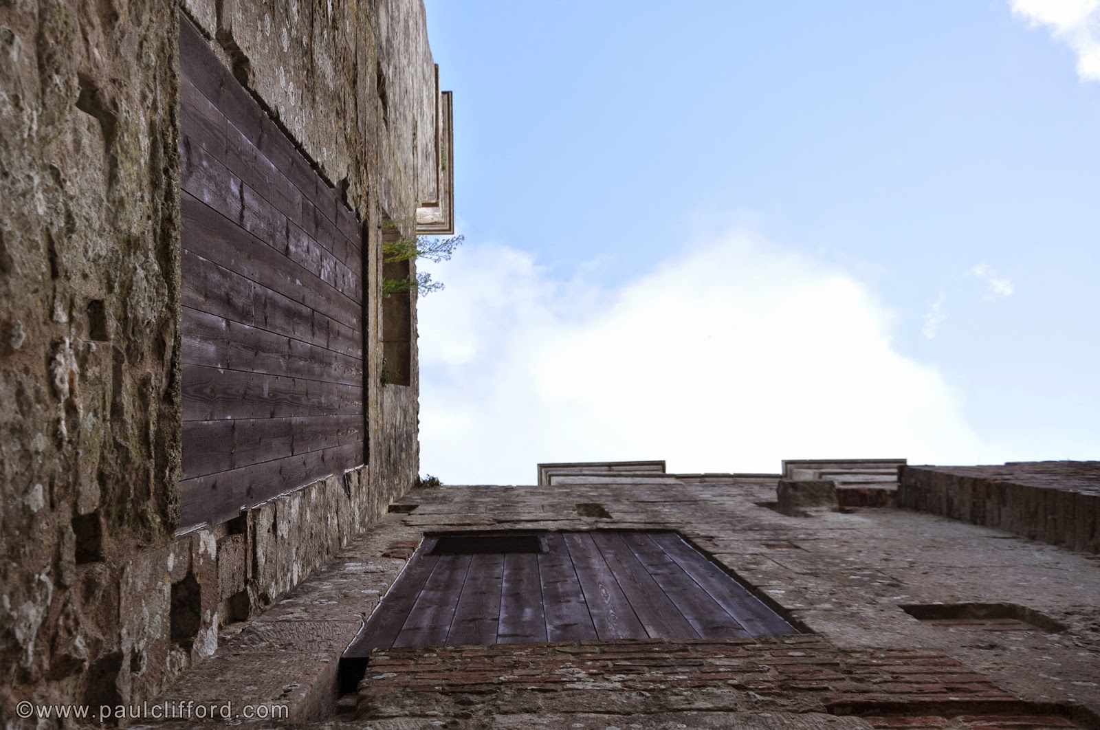
4584 - Ventnor, England, 2011
Two different kinds of Door/Window images to finish. Sometimes it's frustrating not being able to get up to something I'd really like to photograph, or even just look at. Having to find a different solution can lead you literally to a fresh perspective, like it did here.


4666 - London, England, 2011
And finally, a take on a design classic - Trellick Tower. Visually it's iconic, so I've had to literally and figuratively get some distance between myself and the building to find something to say in my own language. This image has been shown publicly a number of times and it's always popular. I think the interest stems from three things - the architecture itself, the customisation by the residents on each of the unique terraces, and the design of the image which draws equally from the other two elements.


That's it for Part One. The Facebook gallery for individual image comments is here, and you can comment below if you want to say anything about the blog post as a whole.

Part Two soon. Thank you for reading! All pictures are available as limited edition prints - click here for details.