Looking at Art: personal and opinionated rambles on what I've seen, probably with a lot of reference to my own work...
Zarina Bhimji at the Whitechapel Gallery, London - until March 9, 2012
I went to London's Whitechapel Gallery yesterday to see the Zarina Bhimji exhibition, plus a talk from the artist. I had heard her name from time to time, but wasn't overly familiar with her work.
The large scale prints give the galleries a similar feel to the recent Paul Graham and Thomas Struth shows there. It's rare to see a major photographic artist these days who doesn't shoot and print in a large format. With someone like Thomas Struth, whose images are considered, carefully composed and shot on large format film, this can work really well. With Bhimji, who seems to shoot in a much more offhand manner, the large pictures only exaggerated some of the problems I had with the prints.
Over the last year, as I have exhibited and sold my work, I have really become comfortable with shooting the images I do, and more confident in my art. It's inevitable that I'd compare other people's work to my own, if only on a personal level. It's impossible to say which art is 'better' or 'worse', as it's so subjective. However, I did note that, where for me personally, composition and object placement in the image is extremely important to, it seemed less so to Bhimji.
In some images, focus fell out in places where you wouldn't expect it to, or something that should have been nice and square was just a bit off, not enough to look like a purposeful decision, but distracting in such large prints. In others, skewed or warped perspectives like the ones below add a vertiginous slant or a warped perspective, detracting from the strengths of the pictures.
Listening to her speak, the impression was that she is very careful about point of view, light, colour and the context of the subject matter, and this does show through in the lovely images.
The thing is, a problems like the ones above are easily solved on the day by choosing your perspective and a suitable lens. I had noted all this before the talk, but the strange thing was I didn't feel I could ask her about it, as I didn't know her work well enough - it seemed disrespectful to talk about the skewed lines and mis-centred, misaligned subjects in a show which has only around 20 pictures from a 25 year period.
With Thomas Struth, who I saw speak last year, I was happy to ask him questions as I knew his work better. Both Struth and Bhimji are both complete strangers to me, but I feel I know Struth more on a personal level through his art.
The major part of the exhibition is Bhimji's new film 'Yellow Patch'. For me, this was streets ahead of the still images. Presented in a cinematic space with surround sound and a super-sharp image, Bhimji explores similar abandoned buildings and spaces, but with perfect dolly trails across the space, or zooms in and out, with lovely symmetry that perfectly suited the subjects. There's also an ideology behind it - see the info at the end of this post.
In fact, it's undeniable that the quality and composition of the images in the film were much more carefully composed - and the film was all the more beautiful for it. It's one of the most photographic films I've seen, shot with a wonderful, analytical, careful eye, which makes the carefree snapshot-y nature of the large prints even more of a shame. The film seemed much more reverent and respectful, and made the images much stronger and more affecting.
Upstairs, there's an earlier film 'Out of Blue' that explores similar territory - you can see some of it here. The projection there is from a DVD transfer and after immersing myself in the luscious film downstairs, it was so full of ghosting and artefacts to be almost unwatchable. What was interesting was that it features some of the compositions shown in the prints, but here they came to life and moved - for example the image below is a print downstairs - upstairs it pans left and everything comes to life. It was an interesting experience - one I don't remember seeing before.
One thing that came up in the talk that interested me was when the oft-repeated question about the absence of people in images was asked, Bhimji replied 'taking pictures of people is boring'. A contentious answer that raised a few laughs, but got me thinking again about why I don't have people in my own images.
The films brought to mind Jane and Louise Wilson, who explore similar visual territory. They do feature people though, and this brings a narrative that for me, isn't always welcome. People can't help bringing their own performance into a picture - even if they are unaware of it being taken. It's why a portrait is a collaboration between the sitter and the photographer. I want control of my image, and unless a person is important to the image, I deliberately won't include them.
So, wonderful film, some nice pictures, and lots for me to think about...
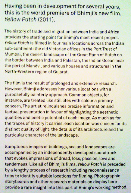
Here's some more info about Yellow Patch, from the Gallery wall -
Zarina Bhimji at the Whitechapel Gallery, London - until March 9, 2012
I went to London's Whitechapel Gallery yesterday to see the Zarina Bhimji exhibition, plus a talk from the artist. I had heard her name from time to time, but wasn't overly familiar with her work.
The large scale prints give the galleries a similar feel to the recent Paul Graham and Thomas Struth shows there. It's rare to see a major photographic artist these days who doesn't shoot and print in a large format. With someone like Thomas Struth, whose images are considered, carefully composed and shot on large format film, this can work really well. With Bhimji, who seems to shoot in a much more offhand manner, the large pictures only exaggerated some of the problems I had with the prints.
Over the last year, as I have exhibited and sold my work, I have really become comfortable with shooting the images I do, and more confident in my art. It's inevitable that I'd compare other people's work to my own, if only on a personal level. It's impossible to say which art is 'better' or 'worse', as it's so subjective. However, I did note that, where for me personally, composition and object placement in the image is extremely important to, it seemed less so to Bhimji.
In some images, focus fell out in places where you wouldn't expect it to, or something that should have been nice and square was just a bit off, not enough to look like a purposeful decision, but distracting in such large prints. In others, skewed or warped perspectives like the ones below add a vertiginous slant or a warped perspective, detracting from the strengths of the pictures.
 |
| Howling like dogs, I swallowed solid air, 2009. © Zarina Bhimji 2009. All Rights Reserved, DACS |
 | |
|
The thing is, a problems like the ones above are easily solved on the day by choosing your perspective and a suitable lens. I had noted all this before the talk, but the strange thing was I didn't feel I could ask her about it, as I didn't know her work well enough - it seemed disrespectful to talk about the skewed lines and mis-centred, misaligned subjects in a show which has only around 20 pictures from a 25 year period.
With Thomas Struth, who I saw speak last year, I was happy to ask him questions as I knew his work better. Both Struth and Bhimji are both complete strangers to me, but I feel I know Struth more on a personal level through his art.
The major part of the exhibition is Bhimji's new film 'Yellow Patch'. For me, this was streets ahead of the still images. Presented in a cinematic space with surround sound and a super-sharp image, Bhimji explores similar abandoned buildings and spaces, but with perfect dolly trails across the space, or zooms in and out, with lovely symmetry that perfectly suited the subjects. There's also an ideology behind it - see the info at the end of this post.
In fact, it's undeniable that the quality and composition of the images in the film were much more carefully composed - and the film was all the more beautiful for it. It's one of the most photographic films I've seen, shot with a wonderful, analytical, careful eye, which makes the carefree snapshot-y nature of the large prints even more of a shame. The film seemed much more reverent and respectful, and made the images much stronger and more affecting.
Upstairs, there's an earlier film 'Out of Blue' that explores similar territory - you can see some of it here. The projection there is from a DVD transfer and after immersing myself in the luscious film downstairs, it was so full of ghosting and artefacts to be almost unwatchable. What was interesting was that it features some of the compositions shown in the prints, but here they came to life and moved - for example the image below is a print downstairs - upstairs it pans left and everything comes to life. It was an interesting experience - one I don't remember seeing before.
 |
| Your Sadness is Drunk, 2001-6. © Zarina Bhimji. All Rights Reserved |
The films brought to mind Jane and Louise Wilson, who explore similar visual territory. They do feature people though, and this brings a narrative that for me, isn't always welcome. People can't help bringing their own performance into a picture - even if they are unaware of it being taken. It's why a portrait is a collaboration between the sitter and the photographer. I want control of my image, and unless a person is important to the image, I deliberately won't include them.
So, wonderful film, some nice pictures, and lots for me to think about...
Here's some more info about Yellow Patch, from the Gallery wall -


