Monday 6 July 2015

Six more things I learnt in my first 100 days on Instagram


Last time, I wrote about the six things I'd learnt during my first month of posting an image daily to Instagram. Click here for that post. I recently posted my 100th daily image - so here's six more things I've learned, this time after 100 days (and a bit) on Instagram.

Instagrammers can follow me @paulcliffordartist , or anyone can see the image feed ainstagram.com/paulcliffordartist .

Note - I struggled last time with differentiating my DLSR camera pictures with my Instagram phone pictures. For the sake of this post, I'm going to call my DSLR work 'Gallery images', and my phone pictures 'Instagram images'. Which isn't to say I wouldn't consider a gallery show of Instagram images, or that I'm not proud of them - it's just a shorthand to save confusion.


Lesson Seven - taking pictures wherever and whenever I like can be a real creative boon


Last time, my first lesson was 'it's great to take pictures wherever and whenever I like'. Back then, I was just getting used to being able to take out a camera anywhere anytime and frame what I saw. A couple of months on I would add that this ability had led to some great pictures, and series of pictures, that I would never have considered taking if not for the ever present camera in my pocket.  

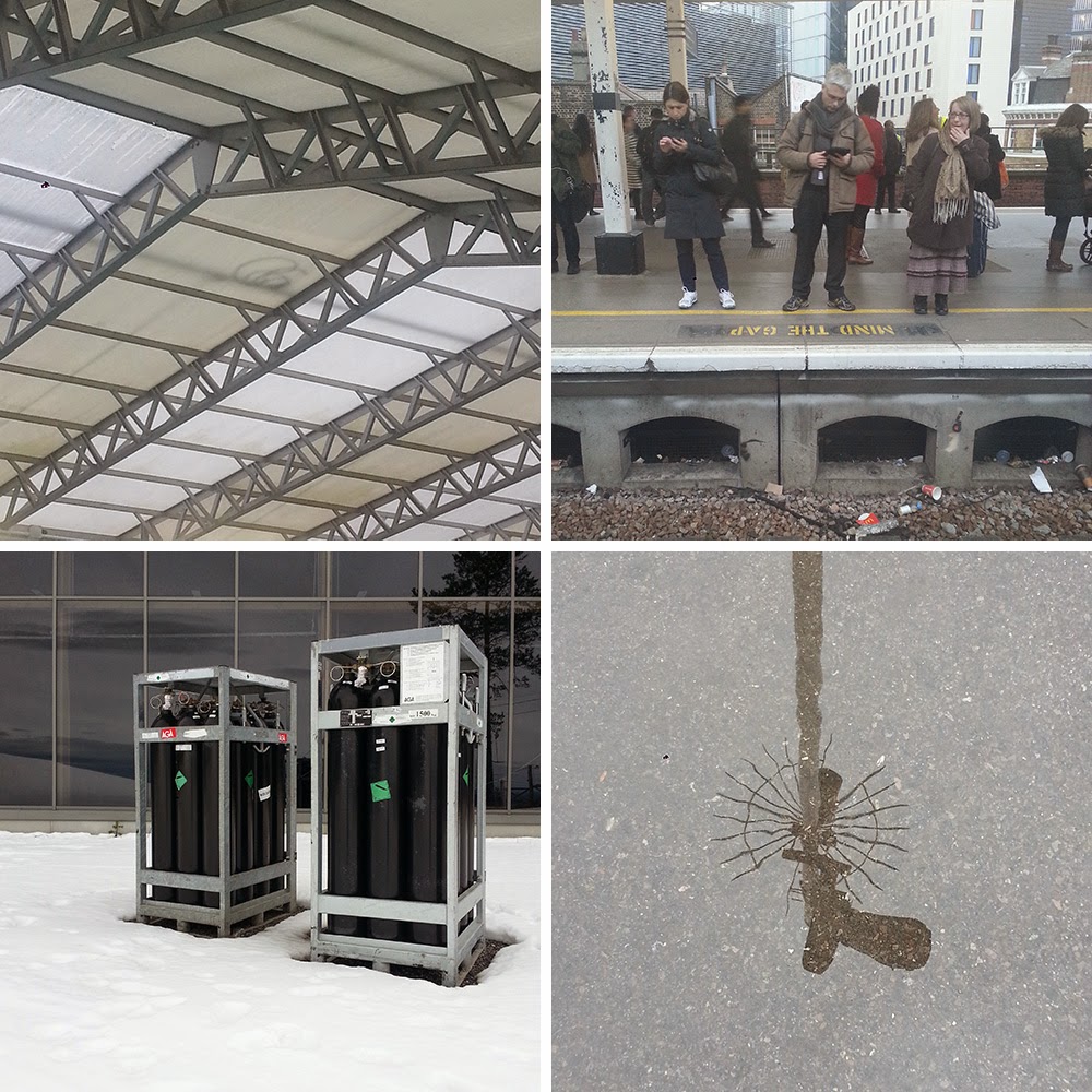
An increasing number of my Instagram pictures have been taken of the architecture of playgrounds when I've been with my children, and without a camera to hand. I have shot in playgrounds before (the 'At Play' series for example, blog post is here). I like the clash of colours and the outlandish design, all worn down by months or years of use. The top left image above works particularly well in the square format I think, and also ties in with the transient nature of my 'Falling Shadows' images - a series that now happily spans my Gallery and Instagram images. Incidentally, this is the 100th Instagram image - what better way to start this post?

The night shot above top right is part of an Instagram series called 'Against The Dark' - I've always liked the illuminated windows of houses from outside, particularly very late at night when you only see them here and there. I rarely have my camera with me on the way home after a night out, but this new camera phone regime has let me look at these patches of light and colour photographically.

Most of my pictures are taken on the street, as I am passing through from one thing to another, rather than on a determined 'photo session' outing. Phone pictures let me work on a real 'hit and run' basis. The image bottom left was taken somehow as I rushed onto a train platform and squeezed it in before my train left - there would not have been enough time to get my DSLR out. As it turned out, I passed this way again later, and I'd liked the Instagram shot so much, I went back to that spot to get a Gallery shot of it.

The last example here at bottom right was taken over the top of someone's head, on a busy London Underground train. Though I might have gotten away with this with a big DSLR, it could have made the rest of my journey very uncomfortable!

Lesson Eight - Instagram and DSLR images each offer their own strengths


Lesson Two after one month was 'phone images are real photographs'. I think at that stage I was honestly still a little bit on the fence about this, but trying hard to embrace the phone camera. I would say now I have absolutely taken the plunge, and somewhat surprisingly for me, the phone camera has actually replaced my DSLR in many ways. I'm taking less and less pictures now on my DSLR - I realise I have an archive now of 1000s of images dating back 20 years, and maybe taking a little break and not adding to that for a while may be a good thing. 

Richard Wentworth, a photographer I very much admire, recently mentioned in a talk that he sees his addiction to taking pictures as an illness. I can somewhat identify with that, it's definitely an itch that needs to be scratched, and it seems Instagram can scratch it as well as a DSLR can.

This doesn't mean I don't take any pictures with my DSLR any more- some things are too good to pass up. Sometimes I shoot on both phone and DSLR - if the image fits.

Two examples above show how things change between the formats - the Instagram image on the left (unfiltered and unfiddled with as always), and an early draft of the DSLR image on the right. The tonal range and image details on the DSLR image is of course much better - perfect for prints (this is why I call them 'Gallery images'!), but that's not really seen on a phone or tablet screen, or necessarily appreciated by the Instagram audience.

The first shot, of the railings, also gives a good example of how a composition might need to be a little more colourful to make in an impact in amongst all the others on Instagram, and how the more traditional rectangular image shape created a different image in my mind, one that requires a bit more looking perhaps. The second shot also shows this I think - I prefer the taller Gallery image, it has more space to breathe, but the Instagram shot has more impact because it is so cropped and feels like it's pushing it's way out of the frame.

Lesson Nine - taking and sharing pictures is fun


Seems like a simple lesson - but this is something that I might have forgotten since I started showing my work publicly again in 2011. Even the most simple gallery show requires selecting images, getting prints, probably frames too, collating information, writing a press release, hanging the work, publicising the show and so much more. 

Very little of this has anything to do with what I enjoy most - creating a picture within a set frame, of something I have seen and enjoyed, and wanted to take away as an image. Even that can be frustrating with a DSLR. With the phone camera, it's fairly easy to see if it's going to work as an Instagram picture or not, and if it doesn't I am able to move on or just delete it.

Like many photographers, my most important audience to please is myself. How does that fit with the 'sharing' nature of Instagram? Well, I've always felt I'd like my pictures to be seen by other people, hopefully to pass on that little bit of pleasure I got from creating the image. That's why I have gallery shows, this blog, the Facebook page, to get my pictures in front of other people.

With Instagram, I can take a picture in seconds and have it shared around the world within hours. It's so easy, I've been able to keep up one a day for more than 100 days, when - confession time - I do somewhat neglect this blog and the Facebook page.

Lesson Ten - I like following a handful of photographers in detail


Another seemingly obvious point - but for me, an important one. I love looking at other people's great photography. In the past this has meant gallery visits, art books, perhaps a few friends and the pictures they choose to share with me personally or on Facebook, and the photographers who I meet regularly as part of The Rooftop Collective in London.

Now, Instagram feeds me a set of images from the people I've chosen to follow. And most of these have been found by clicking on them when they've liked one of my pictures. This gives me a a set of kindred spirits all over the world, people whose pictures I am excited to see, and whose work I can get to know in depth as the weeks go on. And, let's not forget, this is work I would never have seen otherwise. Some examples that spring to mind

The evocative and lyrical shots of @lilia_ornelas_mata that transport me to Madeira
Clean considered lines with bags of character from Berlin's @helinbereket 
Deceptively simple street shots from @trash_nyc that are both amusing and poignant
Straightforward worship of beautiful signage from @typotravel
The fierce colours and elegant compositions of @markojefta

For now there's just a select few feeds I follow, and I fully realise for every photographer I follow there are 100 others on Instagram I might like just as much, or more, but I'm easy with that. The key to Instagram for me is to keep it simple. Too many followings and I would lose touch with the body of work and the style of each one.

Lesson Eleven - I can't stop the series


My Instagram feed was created to act as a sketchbook - each day, a new page, a new image, each independent of each other. After 100 images though, I can scroll through my feed and spot some collections of images that share some of the same elements or feel.

Sometimes this has been intentional - like the aforementioned Against the Dark series, sometimes it's a set of locations that share a similar feel - playgrounds, car parks. Sometimes it's a compositional feature like a strong diagonal or a central circle. 

These things are easier to spot on my Instagram feed rather than in amongst the morass of my Gallery images. It's another one of Instagram's little pleasures for me - and something I might do some work on at some point, perhaps collating a few little collections. This, however, would be making things complicated, and I've been enjoying keeping it simple...

Lesson Twelve - I'm bothered about Likes and Followers, but not that bothered


So far I haven't talked about Likes and Followers - a part of Instagram that is clearly very important to a lot of users. 

I always click through to have a look to see who's liked my images, sometimes this leads me to fake Instagram accounts loaded with generic pictures of boobs, bums and beaches, cocktails, cars and cats. The profile promises me lots of new Followers and Likes if I visit their website. 

Perhaps it's because I grew up in the generation before Social Media, but this chasing of artificial Likes and Followers to just bump up your numbers and compete is of no interest to me. What excites me is finding new people to follow after they Liked one of my pictures, or making interesting connections - I wrote about this last time as Lesson Six - 'it's great to be Liked, better if it's an interesting Like'. It's also nice to get a Like from a photographer whose work you respect.

Of course, with Instagram being so simple there's very little to analyse other than the figures for Likes and Followers. I use iconosquare.com to keep track of how it's all going. At the moment I have a small number of followers, and I pick up one or two organically every week. Which is all well and good. With Likes, as always, it's interesting and surprising who Likes what, and which pictures have the most. The pictures above are my current market leaders. 

I'm certainly small fry in the world of Instagram, I'm no Social Media butterfly and I don't announce my account all over the place. I use hashtags to enhance and maybe explain the pictures, rather than in a calculated way to gain exposure. Consequently my pictures don't get seen as much as they might.

My modest Likes are fine with me, there's enough going on that I can compare reaction from one picture to the next. I've seen pictures on my news feed that are uninteresting to me, getting hundreds of likes, whilst some of my own favourites from my account sit at the bottom of my Like league table. So chasing Likes and trying to cater for my audience would make no sense for me. I'll just continue to try and make pictures I like!


After 100+ images, I'm not going to stop - I'm having a great time with it! Apart from the occasional Facebook share, I'm not showing these pictures anywhere else. So if you're on Instagram, please do join me @paulcliffordartist . If you're not, you can still see all the pictures at instagram.com/paulcliffordartist .


Tuesday 21 April 2015

Six things I learnt in my first month on Instagram


Just over a month ago I started posting images on Instagram under the name @paulcliffordartist. Instagram isn't something I ever thought I would do, but it had gotten to the point that so many people were telling me I'd enjoy it and it would be a great fit for my pictures, I thought I'd give it a try.

I usually work with my pictures fairly slowly, carefully
shooting on my DSLR cameras in RAW format and high resolution, then finishing off on screen and filing them at a later date. I take my time to get everything right. In contrast, all my Instagram pictures have been taken on my phone and posted to Instagram with no adjustments at all.

So after a month of taking photos on my phone and posting one a day to Instagram I've learnt a few things, some of them completely unexpected...


Lesson One - it's great to take pictures wherever and whenever I like


Whether I am in the mood to be taking pictures or not, I'm always looking - constantly framing bits of the world in my head. Sometimes I have my camera with me, sometimes I don't. Generally though, I will have my phone. So, some images I've shot in the last month for Instagram have been in unusual places, at unusual times. 

That could be on the way home after a night out, whilst watching my daughter's swimming lesson, on a shopping trip or in the toilets at the park. That's the four pictures above. It's taken me this month to stop thinking 'I wish I had my camera with me' when I see these things, and to get my alternate process equipment out!


Lesson Two - phone images are real photographs

The main reason I haven't previously used my phone to take 'art' pictures is the innate resistance to it I think a lot of photographers have. Having grown up with film, through early digital and now the camera phone, it's easy to see the smartphone as a 'junior' format not to be taken seriously. But, as we all know a great image is down to the photographer, not the kit. So, after a month on Instagram, I'm less scornful of people I see on the street lining up their photos on their phones, because now I've become one of them.

There are lots of DSLR images on Instagram too, that look a lot 'better' than phone photographs in certain ways. As a concession to this, I've made clear on my profile page that all my images are from a fairly old phone, with no filters applied. However, I'm pretty sure only a handful of people are interested - if you like a picture, the source really doesn't matter.

Lesson Three - Instagram pictures need special consideration


One part of my experience of shooting specifically for Instagram has been finding a new way to shoot. That's not just handling the equipment and it's limitations (and there are some of course!), but also the square format and choosing the actual image content.

With my other work, often the viewer needs to invest a bit of time in just looking to get into the groove of the image. I'm under no illusions that each of my Instagram images are anything more than just one in a sea of scrolling others. So, my Instagram work is leaning towards the more pared down, pleasingly simple end of my work. Most people seeing the images will be looking at them on a small phone screen, so the pictures have to have a clarity and directness about them.

At times when I have had my DSLR at hand, I have found myself shooting two versions of the same shot. The phone picture goes public on Instagram, the DSLR image will get filed away, maybe to be seen by no-one but me. A curious situation, and one that demands a bit of thought for the future. 


Lesson Four - no filter and no edit means no hassle


I post my pictures with no filters or fiddling applied. There isn't a particular need for me to
- it's not a pompous or artistic statement. For me, it simply ties into Instagram being a bit of fun relief from the precision of my other work. Once I start into those Instagram menus, I could fiddle all day. 
With no editing, all I have to do is choose a picture each morning, put it on, title it, tag it and it's done. It's a way to ensure I keep up the pace with one image a day, no matter how busy I am.


Lesson Five - one title and seven hashtags can be hard work, but also insightful


Towards the beginning of my first Instagram month, I happened to mention my new output  to a social media type, who said that seven hashtags was thought the ideal for maximum distribution. Elsewhere I read between five and ten, so I stuck with seven. Now, I don't pretend to understand the mechanics of Instagram at all, but I do know people are seeing my pictures - they are getting Likes from around the world, from other photographers and galleries with similar work. So I guess the hashtags are working.

The discipline of thinking of the seven relevant hashtags, as well as a title, has been very useful for me in thinking about why I take pictures - an avenue of thought that remains constantly fascinating to me. I've never attached titles to my work before, only numbers. As with the no filter approach, I try and come up with something fairly quickly so I can get the picture up and move on. One title and seven hashtags has really got me looking carefully about the picture and wracking my brains with regard to what I want to tell people about it with the title and tags.


Lesson Six - it's great to be Liked, better if it's an interesting Like


I'm sure lots of people don't believe me when I say my print exhibitions are not about selling work and making money, but more about getting the work off my hard drives and in front of people. Of course, it's great when someone does buy something, both because they have chosen to take it away with them, and also as a kind of justification for the physical show.

I have run market stalls in the past with hundreds of my images to sell as small framed objects. What's been interesting about those days are which ones totally unexpectedly become the most popular. Same with the Likes on Instagram. I don't think it really influences the direction of my work, but it gives me another clue or two about where the pictures come from when people agree with what I am visually saying.


I've have had some interesting Likes along the way too. A few examples for the images above - 
On the left, @ninjasupply - a ninja supplier of course, and @glued_n_screwed - a DIY blog. 
At the top - @glitterpoledance, a professional pole dancer and fan of poles in general it seems.  
Finally, on the right, CCTV manufacturer @winnie_cctv

It's great my pictures are getting in front of these people, let alone them hitting Like on them. I've also had some other photographers Like and Follow me, whose work I am really enjoying Following on Instagram. Check out my Following list if you want to have a look for yourself.


So that's my lessons so far. I'm going to continue posting one a day for as long as it interests me, and the majority of the pictures won't be seen anywhere else. Now I've found my feet I'll be flexing a few photographic muscles I haven't used in a while - for example, you may have noticed people creeping into a few pictures, and you don't usually see them in my work...

If you're on Instagram, why not join and follow me @paulcliffordartist for my next month, who knows what we might learn together?

Tuesday 14 April 2015

A Sweco Selection - my new exhibition in Sweden!

3536 - Holy Island, England, 2009

Back in February I was contacted by Sweco Sundsvall Konstförening - a Society funded by and organised by Sweco to promote the appreciation of the visual arts.
They felt my images would work well in their offices in Sweden, based on the company's activities working with engineering and design to create sustainable urban development.


Over the last few weeks I have been working with the Society to remotely co-curate a selection of images from my archive. The exhibition was designed to show a good range of work that would be attractive and appropriate in the office space as well as work conceptually within the context of Sweco's work in the environment.

Led by the Art Society's choices, we created a collection of images everyone was happy with. I visited the offices in Sundsvall, Sweden last week, and we hung the 28 pictures as a series of smaller image selections all around the offices. Again, I worked together with a member of the Society to create the final order and arrangement on site before committing to the final hang.

Robin Wootton from Sweco Sundsvall Konstförening had this to say -

'
I’m very pleased with the exhibition. Paul has an eye for detail that enables him to highlight aesthetic qualities in everyday situations. This should be important for everyone.'

 
3588 - Beckenham, England, 2009

This was a really different way of exhibiting for me, it was a very interesting process to essentially hand over the curatorial reins to somebody else, and they found some connections in my work that I would not have made myself. This is also my largest solo exhibition to date, and my first outside of the UK, so it was exciting for a number of reasons!

There was a launch event too, to tour and discuss the exhibition with the Society. These evenings are usually a chance to catch up with art loving friends as well as meet new people and encounter new opinions about the pictures. I love to hear what other people think of my work, and as I knew no-one personally this time there was plenty of time to talk about the work. The discussions that arose often had an environmental, geological or heavily practical theme, and there were certainly some Sweco style questions I hadn't heard before.

I'll run through the sets of images below with some brief thoughts and recollections of the launch night. I've shown them here in the same configurations as they appear on the walls - you can click on each set to enlarge it.

There's also a full online catalogue for the show on my website here, where you can find out where each picture was taken, and also take a much more detailed look at them individually. There's a Facebook catalogue too here, where you can like your favourites and leave comments if you wish.


This first group is mainly greens and grasses. Talk at the launch event centred around that stranded yellow bollard and identifying just what those colourful spots were. With the bollard, I was asked if I staged my pictures at all - I absolutely don't. If you want to know what the spots are, ask me in the comments section below!

This being Sweco - a company that has to know all about what goes on underground - there was also a bit of discussion about the blue panel and how the water supply works in the UK compared to Sweden! 


There was a darker section of corridor in the offices, and remembering how well the Evening in Venice show worked - an entire show of very dark pictures visible only by torchlight - I knew this selection of four dim pictures all about light would work well there. A good example of a lesson learned from having limitations applied to your work, and your exhibitions.

These work really well as rich physical prints - the full effect of the light and colour against the dark can't be matched on a screen. 

This selection has some old favourites. After my comprehensive Doors and Windows shows, I am a bit wary of revisiting those pictures, but having had them selected by the Art Society I was happy to recontextualise some of them in this mini exhibition of six images. This set was sited in the main kitchen area, and the bright, airy colours were important to enhance the relaxed atmosphere. 

This is a curious little set of four that was hung as you see it here in a square formation. I think it's a great example of how we were able to bring different images together in this show to create what felt like small collaborations between the pictures. These four work really well I think, and I'm not sure why. The warning sign was a popular choice - everyone seemed to find it as unsettling as I do.

I also had to do a little explaining about the lido In Broadstairs, and the grand Victorian English tradition of taking time by the sea. Since those heady times nature has reclaimed the lido, making it little more than a square puddle on the rocks instead of the deep bathing pool it once had been. I think this is one of the reasons it was selected, as was the tree root image perhaps, both pertinent to Sweco's operations and thus hopefully of interest to their staff, in however abstract and subconscious a way.

The remaining pictures in the show were all pairs, selected to work off each other as well as individually. These were set at the bottom of a staircase, and from a distance looked almost like the same image twice. Juxtaposing the two kicked off conversations about city life versus the coast, and also how the make up of our cities, the materials themselves, are from nature, the sand not that different to the concrete.

Another pair. These two work so well together - the match was made by a member of the Art Society - a great curatorial spot!
It seems satellite dishes didn't take off in central Sweden as much as they did in the UK in the late 20th Century, as people were surprised to see so many in one place - a fairly common sight in and around UK cities.
A pair that swirl and dance around each other. The amazing brickwork sparked a lyrical chat about the quality of handbuilt Industrial Revolution era factories and industry compared to today's more flat packed, utilitarian architecture.

These last two are of particular interest to the Rail and Road workers, and both use the everyday languages of transit to create mystifying images that exist within that structure and work as graphic images too. In fact, it was pointed out that the final image bears an uncanny resemblance to the Sweco logo, a full 2 years before I had seen it!


And that wraps it up. I am grateful to
Sweco Sundsvall Konstförening for this unique, unusual, interesting and rewarding opportunity. It's strange to think of my pictures all so far away now I'm back in the UK, but I know they are in good hands!

As always, any comments are welcome below. And as always, thank you for reading.


Friday 6 February 2015

Harvest of 2011 Part Three - The 'Something Else' Power of Symbols

Harvest of 2011 links

Harvest of 2011 continues... previous parts are linked just above.

Click on each image to enlarge it, and also comment on and Like images at the Facebook gallery - here.
You can comment on the post as a whole at the bottom.
All pictures are available as limited edition prints - click here for details.


These are some more of my favourite 2011 images. This time I'll be writing not so much about how the image looks, or was composed, but instead dealing more with how our minds make sense of the pictures, attaching meanings in some quite astounding ways.

The images here include text, numbers and symbols - always signifiers for something else, something that someone wants you to know or think. As such, they have to be handled carefully in photographs, so as not to rupture or overwhelm careful composition.


4580 - Totland, England, 2011
When I include a signifier like text in an image, it's mainly as another compositional element. But it can't be denied that including visual language like the word 'RAMBLER' unavoidably adds something else. It's that 'something else' that I always bear in mind when including text, numbers or symbols. Although this image has a lot to visual information, the mind is initially only thinking 'RAMBLER' and the picture therefore takes a few moments to settle down. The word itself does offer up a clue as to how the image could be interpreted - rather than cluttering the meaning, words may extend it.


4423 - London, England, 2011
Whilst RAMBLER was a part of the image, sometimes my use of text plays a more major role. This picture becomes a little jarring, almost like an optical illusion, with the simplest of means.


4114 - London, England, 2011
Here is another image that plays with expectations of text. 'NO' is usually a precursor to another word, the start of a prohibition. By again looking past the text into the image itself, we can see that this 'NO' isn't that, and never was. Stripped of it's original purpose, it now resembles instead a blunt graffiti-esque statement.


4155 - London, England, 2011
The more I think about the messages in the environment, the more they become abstracted for me - and in the context of thinking about text, hopefully I have allowed you to see this image differently. For me, it is a very nourishing picture that gains more meaning the more you time you give it.


4171 - London, England, 2011
4352 - Ange, Sweden, 2011
4361 - Blomsterstigen, Sweden, 2011
Numbers are of course equally significant in the environment. These three pictures have very little in common visually, but all feature a simple two digit number. Each number delivers a different message to us, discernable by context based on our own previous experience of how they are used. An address, an instruction, a label.

We can see how much work our minds put in by simply flipping two of these upside down -


Perhaps the effect is a little lessened by seeing the originals above directly before, but you can see how the numbers become just shapes, or perhaps you automatically redefine them as 'LI' and 'OE' even though this makes little sense.


4440 - Sevenoaks, England, 2011
This well known symbol is clear in its meaning - it's that very meaning that the photograph plays upon. The sign becoming overgrown by the seemingly gentler yet absolutely overwhelming force of nature, the clash of colour reflecting the conflict, and perhaps a further meaning warning against incursion into nature. A simple image lent so much more by symbolism, and by the deeper meaning each viewer brings.


4563 - Needles, England, 2011
4616 - Ventnor, England, 2011
Both of these are, it could be said, strange and unusual signs. Both seem a little unreal. Clearly rockets haven't been tested for some time, but the image retains a kind of dangerous romance. It's unclear from the second image what we are looking at and the text brings interesting questions - what is this thing, how does it work? Taking these signs out of context, keeping elements out of the frame, leaves much of the interpretation to the viewer. 


4595 - Shanklin, England, 2011
 A more familiar piece of 'signage', but again not quite right.


4643 - London, England, 2011
I really enjoy the mixture of materials in this - the hard pavements, the small puddle - solid and liquid, all that's missing is GAS - provided to us in a signifier, emerging from the water, held in place by the square paving around it.


4602 - Cowes, England, 2011
Finally, a message disappearing into the water - another example of meaning left open to misinterpretation by reality.


Throughout this post I've tried to talk about meaning and interpretation - and less about colour and composition - it's worth going back and looking at the images on a purely visual level, without reading the text. You can also see them without my commentary at the Facebook gallery here. Your own commentary is very welcome there though, on each image as you choose. Alternatively, you can comment below if you want to say anything about the blog post as a whole. Please do comment, I love any kind of feedback. Also feel free to link to any of your own images or other pictures you think might be of interest.

Part Four soon. Thank you for reading! All pictures are available as limited edition prints - click here for details.


Harvest of 2011 links
Introduction - Part One
Part Two